Graphic Elements
The Springfield College identity has a variety of graphic tools that create a unique look and help people recognize our brand. When used consistently, these elements create continuity across all communications. Each of these elements can be used on its own or in conjunction with others.
Overview
Like spirit, mind, and body, our graphic elements are rooted in the Gulick triangle that represents Springfield College. By using the angles of the equilateral triangle, we can create dynamic and active communications that relate back to the essence of Springfield College.

Rules
Rules can quickly emphasize a key word or phrase, or can draw the viewer’s eye through the hierarchy of a layout.
Crops
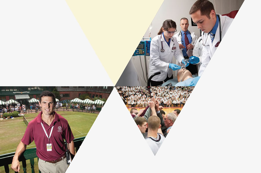
When not using full-bleed images, cropping photos is a great way to increase visual interest without adding clutter.

Angles
Bold, solid shapes help to create dynamic layouts and can overlay images and white space.
Rules
This element should be used subtly to complement the image, with its stroke weight never dominating the overall content of the photograph.

Crops
The angles based on the Gulick triangle (always 60° and 120°) offer many different ways to crop photographs. This graphic element works best when it’s balanced with large areas of white space.

Angles
Solid graphic shapes built on the same angles can also increase visual interest. Use them to emphasize a specific part of an image, or to add color to an image that may not be completely engaging on its own.


