Identity
Our Logo
The Springfield College logo represents us at the very highest level. It’s vital to our brand: acting as a signature, an identifier, and a stamp of quality. We should always use it consistently throughout our communications.
NOTE: The Springfield College logo should never be recreated or typeset. Only official logo files should be used in our communications. These files can be requested for use.
To maintain consistency with the logo, a few simple guidelines should be followed.
Primary Usage


Another acceptable option is to reverse the logo out to white on darker backgrounds and images.


Minimum Size
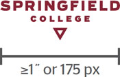
To maintain full legibility, never reproduce the logo at widths smaller than 1 inch (for print) or 175 pixels (for screen). There is no maximum size limit, but use discretion when sizing the logo. The logo should never be the most dominant element on the page, but instead should live comfortably and clearly as an identifying mark.
Clear Space
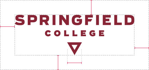
To ensure that clear space is maintained around the logo for legibility and prominence, photos, text, and graphic elements must follow the guidelines illustrated here. Use the side of the triangle as a measuring tool for proper clearance.
Extended Clear Space
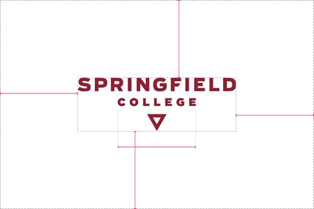
When the Springfield College logo appears with another logo—from within or outside the College—the logo requires extended clear space to maintain its integrity, as shown here. No other logo should fall within these parameters.
Note: This extended clear space applies only to partner and co-branded logos. It does not affect the clear space for photos, text, graphic elements, or margins.
Secondary Usage
An alternate configuration of the logo can be used when the display formats aren’t conducive to the primary mark. Examples include mobile applications and other places where space is limited.

Social Media
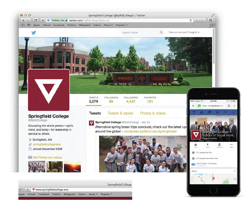
Because social media avatars vary significantly in size, use the Gulick triangle (link to Gulick triangle section) by itself, without type. This is the only acceptable use of the Gulick triangle without the words “Springfield College”.
Placement
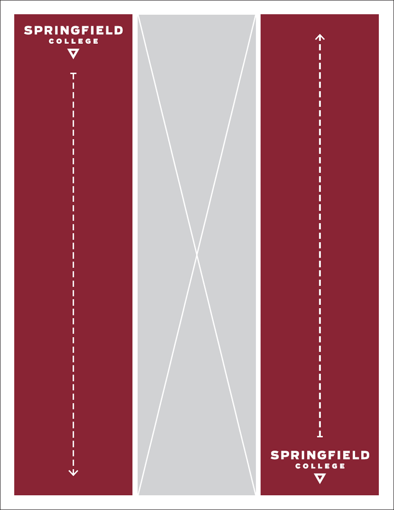
The preferred placement for the logo is in the upper left or lower right segment of a layout. Anywhere in the colored areas shown below is acceptable, although corners are best. This way, the logo becomes a grounding element that appears consistently on all pieces.
